Digicod | Digital Agency HTML Template
Firstly, a huge thanks for purchasing this theme, your support is truly appreciated!
Template Features:
- 81+ HTML Files
- 15 Index Multi Pages Demo
- 15 Index Single Pages Demo
- 15 Index Dark Pages Demo
- 15 Index boxed Pages Demo
- 1 Index RTL Page Demo
- Easy to customize
- HTML5 & CSS3
- Clean & Simple Design
- Fully Responsive Layout
- Crossbrowser Compatible with Edge, IE9+, Firefox, Safari, Opera, Chrome
- Revolution Slider added. you save $14.00
- Menuzord - Responsive Megamenu added. you save $7.00
- Retina ready
- Font Awesome 400+ icons
- 7 Stroke 200+ icons
- Elegant Icon Font 360+ icons
- Powered with Bootstrap
- Smooth animation
- Parallax sections
- Working Ajax contact form with validation
- Google Maps easy to setup via data attributes
- Powerful shortcodes
- Responsive video
- Well documented
- Created: July 19, 2023
- Last Update: July 22, 2023
- Version 2.0
- By: ThemeMascot
- Email: thememascot@gmail.com
Fonts used
By default, the template loads Jost and Kumbh Sans font from Google Web Font Services, you can change the font with the one that suits you best.
You will find the font code in the "style-main.css" file in the "css" folder:
@import url('https://fonts.googleapis.com/css2?family=Jost:wght@300;400;500;600;700;800;900&family=Kumbh+Sans:wght@300;400;500;600;700;800;900&display=swap');
Getting Started
Unzip the archive and find out the folder Digicod-client-html. There are all the template files in this folder.
The file and folder structure is something like this:
- /css — folder with css files.
- /fonts — folder with icon fonts.
- /images — folder with image files.
- /includes — folder with twitter, phpmailer and different appointment, contact form php handler.
- /js — folder with Javascript files.
- /scss — folder containing scss files of the theme.
- index-*.html, ... — Index page demos.
- page-*.html, ... — Different inner page demos.
Upload the template files to server with the help of one of the FTP-clients like FileZilla.
HEAD CSS Structure
These are the css files which are loaded into the template in Head Section.
<!DOCTYPE html>
<html lang="en">
<head>
<meta charset="utf-8">
<title>Your HTML Template | Home Page</title>
<!-- Stylesheets -->
<link href="css/bootstrap.min.css" rel="stylesheet">
<link href="css/style.css" rel="stylesheet">
<link href="css/responsive.css" rel="stylesheet">

<link rel="shortcut icon" href="images/favicon.png" type="image/x-icon">
<link rel="icon" href="images/favicon.png" type="image/x-icon">

<!-- Responsive -->
<meta http-equiv="X-UA-Compatible" content="IE=edge">
<meta name="viewport" content="width=device-width, initial-scale=1.0, maximum-scale=1.0, user-scalable=0">
<!--[if lt IE 9]><script src="https://cdnjs.cloudflare.com/ajax/libs/html5shiv/3.7.3/html5shiv.js"></script><![endif]-->
<!--[if lt IE 9]><script src="js/respond.js"></script><![endif]-->
</head>
Dark Layout
<!DOCTYPE html>
<html lang="en" xmlns="http://www.w3.org/1999/xhtml">
	<head>
		<meta charset="UTF-8">
		<title>Document</title>
		<!-- CSS | Dark Layout -->
		<link href="css/style-main-dark.css" rel="stylesheet" type="text/css" id="link-bg-color">
	</head>
	<body class="dark">
		body content here ......
	</body>
</html>
By default every layout is appeared in white version. If you want to change it into dark layout from white then simply add dark class in the body tag like this
<body class="dark">
Finally include this style-main-dark.css css file in the head tag as follows as <link href="css/style-main-dark.css" rel="stylesheet" type="text/css">
Boxed Layout
<!DOCTYPE html>
<html lang="en" xmlns="http://www.w3.org/1999/xhtml">
	<head>
		<meta charset="UTF-8">
		<title>Document</title>
	</head>
	<body class="boxed-layout pt-40 pb-40 pt-sm-0" data-bg-img="images/pattern/p1.png">
		body content here ......
	</body>
</html>
By default every layout is appeared in fullwidth mode. If you want to change it into boxed layout from fullwidth mode then simply add boxed-layout lightgray pt-40 pb-40 classes into the body tag like this <body class="boxed-layout pt-40 pb-40 pt-sm-0" data-bg-img="images/pattern/p1.png">
Rtl Layout
<!DOCTYPE html>
<html dir="ltr" lang="en">
	<head>
		<meta charset="UTF-8">
		<title>Document</title>
		<!-- CSS | RTL Layout -->
		<link href="css/bootstrap-rtl.min.css" rel="stylesheet" type="text/css">
		<link href="css/style-main-rtl.css" rel="stylesheet" type="text/css">
		<link href="css/style-main-rtl-extra.css" rel="stylesheet" type="text/css">
	</head>
	<body>
		body content here ......
	</body>
</html>
By default every layout is appeared in ltr direction. If you want to change it into rtl direction from ltr then simply add dir="rtl" attribute in the html tag like this
<html lang="en" dir="rtl">
Finally include this style-main-rtl.css and style-main-rtl-extra.css file in the head tag as follows:
<link href="css/bootstrap-rtl.min.css" rel="stylesheet" type="text/css">
<link href="css/style-main-rtl.css" rel="stylesheet" type="text/css">
<link href="css/style-main-rtl-extra.css" rel="stylesheet" type="text/css">
Javascript Structure
These are the JS files which are loaded into the template before the end of the HEAD and BODY Section.
<script src="js/jquery.js"></script>
<script src="js/popper.min.js"></script>
<!--Revolution Slider-->
<script src="plugins/revolution/js/jquery.themepunch.revolution.min.js"></script>
<script src="plugins/revolution/js/jquery.themepunch.tools.min.js"></script>
<script src="plugins/revolution/js/extensions/revolution.extension.actions.min.js"></script>
<script src="plugins/revolution/js/extensions/revolution.extension.carousel.min.js"></script>
<script src="plugins/revolution/js/extensions/revolution.extension.kenburn.min.js"></script>
<script src="plugins/revolution/js/extensions/revolution.extension.layeranimation.min.js"></script>
<script src="plugins/revolution/js/extensions/revolution.extension.migration.min.js"></script>
<script src="plugins/revolution/js/extensions/revolution.extension.navigation.min.js"></script>
<script src="plugins/revolution/js/extensions/revolution.extension.parallax.min.js"></script>
<script src="plugins/revolution/js/extensions/revolution.extension.slideanims.min.js"></script>
<script src="plugins/revolution/js/extensions/revolution.extension.video.min.js"></script>
<script src="js/main-slider-script.js"></script>
<!--Revolution Slider-->
<script src="js/bootstrap.min.js"></script>
<script src="js/jquery.fancybox.js"></script>
<script src="js/jquery.countdown.js"></script>
<script src="js/wow.js"></script>
<script src="js/mixitup.js"></script>
<script src="js/appear.js"></script>
<script src="js/owl.js"></script>
<script src="js/swiper.min.js"></script>
<script src="js/script.js"></script>
HTML Structure
The general template structure is the same throughout the template. Here is the general structure:
<section id="sectionID_if_Needed">
	<div class="container">
		<div class="row">
			<!-- Section Title -->
			<div class="section-title">
				<div class="col-md-12">
					...          ...          ...
				</div>
			</div>
			<!-- Section Content -->
			<div class="section-content">
				<div class="col-md-12">
					...          ...          ...
				</div>
			</div>
		</div>
	</div>
</section>
Custom Data Attributes
| Data Attribute: | Details |
|---|---|
| data-bg-color |
|
| data-bg-img |
|
| data-text-color |
|
| data-font-size |
|
| data-height |
|
| data-border |
|
| data-margin-top |
|
Divider
1. Basic Divider
Just place a class "divider" to a section to make it divider as like below
<section id="sectionID_if_Needed" class="divider">
	<div class="container">
		<div class="row">
			<div class="col-md-12">
				-------   Content here  -------
			</div>
		</div>
	</div>
</section>
2. Fullscreen Divider as like Home section
Just place a class "fullscreen" beside "divider" to make it fullscreen divider
<section id="sectionID_if_Needed" class="divider fullscreen">
	<div class="container">
		<div class="row">
			<div class="col-md-12">
				-------   Content here  -------
			</div>
		</div>
	</div>
</section>
3. Divider with Image Background
Just place your image location "images/bg1.jpg" inside data-bg-img to place an image in the background of the divider
<section id="sectionID_if_Needed" class="divider" data-bg-img="images/bg1.jpg">
	<div class="container">
		<div class="row">
			<div class="col-md-12">
				-------   Content here    -------
			</div>
		</div>
	</div>
</section>
3. Divider with Color Background
You can also add background color by using predefined attributes like "data-bg-color"
<section data-bg-color="#1A1A1A">
	<div class="container">
		<div class="row">
			<div class="col-md-12">
				-------   Content here  -------
			</div>
		</div>
	</div>
</section>
4. Divider with Parallax Image Background
Just place a class "parallax" beside "divider" to make it Parallax Background
<section id="sectionID_if_Needed" class="divider parallax" data-stellar-background-ratio="0.5" data-bg-img="images/bg1.jpg">
	<div class="container">
		<div class="row">
			<div class="col-md-12">
				------- Content here -------
			</div>
		</div>
	</div>
</section>
5. Divider with Black Overlay
Just place a class "layer-overlay" beside "divider" to make a black layer overlay
<section id="sectionID_if_Needed" class="divider layer-overlay overlay-dark">

	<div class="container">
		<div class="row">
			<div class="col-md-12">
				-------    Content here   -------
			</div>
		</div>
	</div>
</section>
6. Divider with White Overlay
Just place a class "overlay-white" beside "layer-overlay" to make a white layer overlay
<section id="sectionID_if_Needed" class="divider layer-overlay overlay-white">
	<div class="container">
		<div class="row">
			<div class="col-md-12">
				-------    Content here   -------
			</div>
		</div>
	</div>
</section>
Layer Overlay Utility Classes:
.layer-overlay {
	position: relative;
}
.layer-overlay::before {
	background: rgba(17, 17, 17, 0.65) none repeat scroll 0 0;
	content: " ";
	height: 100%;
	left: 0;
	position: absolute;
	top: 0;
	width: 100%;
	z-index: 0;
}
.layer-overlay.overlay-light::before {
	background-color: rgba(255, 255, 255, 0.8);
}
.layer-overlay.overlay-lighter::before {
	background-color: rgba(255, 255, 255, 0.7);
}
.layer-overlay.overlay-deep::before {
	background-color: rgba(255, 255, 255, 0.9);
}
.layer-overlay.overlay-dark::before {
	background-color: rgba(17, 17, 17, 0.85);
}
.layer-overlay.overlay-dark-deep::before {
	background-color: rgba(17, 17, 17, 0.9);
}
.layer-overlay.overlay-dark-light::before {
	background-color: rgba(17, 17, 17, 0.8);
}
.layer-overlay.overlay-white::before {
	background-color: rgba(255, 255, 255, 0.9);
}
.layer-overlay.overlay-white-deep::before {
	background-color: rgba(255, 255, 255, 0.92);
}
.layer-overlay.overlay-white-light::before {
	background-color: rgba(255, 255, 255, 0.85);
}
.layer-overlay.layer-pattern::before {
	background-image: url(../images/pattern1.png);
	background-color: rgba(0, 0, 0, 0.6);
}
.layer-overlay.layer-pattern2::before {
	background-image: url(../images/pattern2.png);
	background-color: rgba(0, 0, 0, 0.8);
}
.layer-overlay.layer-pattern3::before {
	background-image: url(../images/pattern3.png);
	background-color: rgba(0, 0, 0, 0.8);
}
.layer-overlay.maximage-layer-overlay::before {
	z-index: 1;
}
.layer-overlay.overlay-blue::before {
	background-color: rgba(1, 162, 208, 0.9);
}
.layer-overlay.overlay-blue-light::before {
	background-color: rgba(1, 162, 208, 0.45);
}
.layer-overlay.overlay-pink::before {
	background-color: rgba(235, 110, 142, 0.9);
}
.layer-overlay.overlay-pink-light::before {
	background-color: rgba(235, 110, 142, 0.45);
}
.layer-overlay.overlay-brown::before {
	background-color: rgba(60, 171, 111, 0.9);
}
.layer-overlay.overlay-brown-light::before {
	background-color: rgba(60, 171, 111, 0.45);
}
.layer-overlay.overlay-yellow::before {
	background-color: rgba(255, 187, 34, 0.9);
}
.layer-overlay.overlay-yellow-light::before {
	background-color: rgba(255, 187, 34, 0.45);
}
.layer-overlay.overlay-green::before {
	background-color: rgba(16, 196, 92, 0.9);
}
.layer-overlay.overlay-green-light::before {
	background-color: rgba(16, 196, 92, 0.45);
}
Preloader
There are two types of preloader we used
1. gif animated images
and
2. CSS animated preloader
It's very easy to use. Here are some examples:
Gif Image preloader example:
<div id="preloader">
	<div id="spinner">
		<img src="images/preloaders/1.gif" alt="">
	</div>
</div>
For changing Gif preloader you have to just replace image name in line number 3 instead of (1.gif) to 2,3,4... up to 12.gif. For more details, just open features-preloader.html file.
CSS animated preloader example:
<div id="preloader">
	<div id="spinner">
		<div class="cssload-container-whirlpool">
			<div class="cssload-whirlpool"></div>
		</div>
	</div>
</div>
For changing CSS preloader you have to just copy those html code and replace your existing preloader in index files. For more details, just open features-preloader.html file.
Contact Form
The Contact form html code example is as follows :
<!-- Contact Form -->
<form id="contact_form" name="contact_form" class="" action="includes/sendmail.php" method="post">

	<div class="row">
		<div class="col-sm-6">
			<div class="form-group">
				<label for="form_name">Name <small>*</small></label>
				<input id="form_name" name="form_name" class="form-control" type="text" placeholder="Enter Name" required="">
			</div>
		</div>
		<div class="col-sm-6">
			<div class="form-group">
				<label for="form_email">Email <small>*</small></label>
				<input id="form_email" name="form_email" class="form-control required email" type="email" placeholder="Enter Email">
			</div>
		</div>
	</div>

	<div class="row">
		<div class="col-sm-6">
			<div class="form-group">
				<label for="form_name">Subject <small>*</small></label>
				<input id="form_subject" name="form_subject" class="form-control required" type="text" placeholder="Enter Subject">
			</div>
		</div>
		<div class="col-sm-6">
			<div class="form-group">
				<label for="form_phone">Phone</label>
				<input id="form_phone" name="form_phone" class="form-control" type="text" placeholder="Enter Phone">
			</div>
		</div>
	</div>

	<div class="form-group">
		<label for="form_name">Message</label>
		<textarea id="form_message" name="form_message" class="form-control required" rows="5" placeholder="Enter Message"></textarea>
	</div>
	<div class="form-group">
		<input id="form_botcheck" name="form_botcheck" class="form-control" type="hidden" value="" />
		<button type="submit" class="btn btn-dark btn-theme-colored btn-flat mr-5" data-loading-text="Please wait...">Send your message</button>
		<button type="reset" class="btn btn-default btn-flat btn-theme-colored">Reset</button>
	</div>
</form>

<!-- Contact Form Validation-->
<script type="text/javascript">
	$("#contact_form").validate({
		submitHandler: function(form) {
			var form_btn = $(form).find('button[type="submit"]');
			var form_result_div = '#form-result';
			$(form_result_div).remove();
			form_btn.before('<div id="form-result" class="alert alert-success" role="alert" style="display: none;"></div>');
			var form_btn_old_msg = form_btn.html();
			form_btn.html(form_btn.prop('disabled', true).data("loading-text"));
			$(form).ajaxSubmit({
				dataType:  'json',
				success: function(data) {
					if( data.status == 'true' ) {
						$(form).find('.form-control').val('');
					}
					form_btn.prop('disabled', false).html(form_btn_old_msg);
					$(form_result_div).html(data.message).fadeIn('slow');
					setTimeout(function(){ $(form_result_div).fadeOut('slow') }, 6000);
				}
			});
		}
	});
</script>
For placing your email address, just go to form action location action="includes/sendmail.php" and open the sendmail.php file in includes folder. In that php file at line 32, you will see $toemail = 'spam.thememascot@gmail.com'; Now just replace that email address by your own email address. Now your contact form is ready!
Mailchimp Subscribe Form
The Mailchimp subscribe form html code example is as follows :
<!-- Mailchimp Subscription Form-->
<form id="mailchimp-subscription-form1" class="newsletter-form mt-40">
<label for="mce-EMAIL"></label>
<div class="input-group">
<input type="email" id="mce-EMAIL" data-height="45px" class="form-control input-lg" placeholder="Your Email" name="EMAIL" value="">
<span class="input-group-btn">
<button type="submit" class="btn btn-colored btn-dark btn-lg m-0" data-height="45px">Subscribe</button>
</span>
</div>
</form>
<!-- Mailchimp Subscription Form Validation-->
<script type="text/javascript">
$('#mailchimp-subscription-form1').ajaxChimp({
callback: mailChimpCallBack,
url: '//thememascot.us9.list-manage.com/subscribe/post?u=a01f440178e35febc8cf4e51f&id=49d6d30e1e'
});
function mailChimpCallBack(resp) {
// Hide any previous response text
var $mailchimpform = $('#mailchimp-subscription-form1'),
$response = '';
$mailchimpform.children(".alert").remove();
console.log(resp);
if (resp.result === 'success') {
$response = '<div class="alert alert-success"><button type="button" class="close" data-dismiss="alert" aria-label="Close"><span aria-hidden="true">×</span></button>' + resp.msg + '</div>';
} else if (resp.result === 'error') {
$response = '<div class="alert alert-danger"><button type="button" class="close" data-dismiss="alert" aria-label="Close"><span aria-hidden="true">×</span></button>' + resp.msg + '</div>';
}
$mailchimpform.prepend($response);
}
</script>
Now you just have to replace the existing Mailchimp List URL by your own Mailchimp List URL which is shown in line 16 . Now your mailchimp subscribe form is ready!
Flickr Feed
To add Flickr feed, just place the following code:
<div id="flickr-feed" class="clearfix">
<!-- Flickr Link -->
<script type="text/javascript" src="http://www.flickr.com/badge_code_v2.gne?count=8&display=latest&size=s&layout=x&source=user&user=52617155@N08"></script>
</div>
Replace the value of attribute count=8, user=52617155@N08
Twitter Feed
To add Twitter feed Carousel, just place the following code:
<div class="twitter-feed twitter-carousel text-center pt-60 pb-60" data-username="Envato"></div>
To add Twitter feed List, just place the following code:
			<div class="widget">
				<div class="twitter-feed clearfix" data-username="Envato"></div>
			</div>
And then change the Twitter username.
Instagram Feed
Instagram Feed - List
To add Instagram feed List, just place the following code:
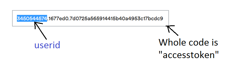
<div id="instafeed1" class="instagram-feed" data-userid="3450544574" data-accesstoken="3450544574.1677ed0.7d0725a565914415b40a4953c17bcdc9" data-limit="12" data-resolution="low_resolution"></div>
Here the main important things are userid and accesstoken. To collect userid and accesstoken, just follow the below steps:
- Login to your instagram account from here instagram.com
- Then goto http://instagram.pixelunion.net/ and press "Generate Access Token" button.
- Copy the generated access token from there and put it into the code
See screenshot:
Instagram Feed - Carousel
To add Instagram feed Carousel, just place the following code:
<div id="instafeed2" class="instagram-feed-carousel" data-userid="3450544574" data-accesstoken="3450544574.1677ed0.7d0725a565914415b40a4953c17bcdc9" data-limit="12" data-resolution="low_resolution"></div>
Javascript Links
These are the scripts used in the template with their related links for documentation.
- jQuery
- Bootstrap Framework
- Smoothscroll
- Infinite Scroll
- scrollTo
- jQuery Easing
- SmoothScroll
- jQuery appear plugin
- jQuery Cookie Plugin
- Isotope
- jquery Stellar parallax
- Menuzord Mega Menu
- jQuery Cycle Plugin
- Maximage Slider
- Jquery Parallax
- Owl Carousel
- FlexSlider
- Magnific Popup
- Nivo Lightbox
- PrettyPhoto Lightbox
- FullCalendar
- WOW
- YTPlayer
- FitVids
- Vide
- Jflickrfeed
- JQuery Knob
- Typed Animation
- Pretty Maps
- Retinajs
- Ajaxchimp
- Pagination
- Tweetie Twitter Feed
- Instafeed
- animateNumbers
- CountDown
Credits
Note: All images are used for preview purpose only and not included in the final purchase files.
Images from:
https://www.flickr.com/
http://pixabay.com/
http://www.pixeden.com/free-graphics
http://dribbble.com/
https://wallpaperscraft.com/
http://behance.net/
http://pinterest.com/
Video from:
http://youtube.com/
https://vimeo.com/
Google Fonts:
Roboto
Merriweather
Icon Fonts:
Font Awesome Icon Font
Pe-icon-7-stroke
Elegant Icon Font
Support
Again, thank you for purchasing this Template!
If you have any questions, please use our profile contact form on Envato ( http://themeforest.net/user/ThemeMascot ).
We aim to answer all questions within 24 hours . In some cases the waiting time can be extended to 48 hours.
Email: thememascot@gmail.com